1.CSS三大特性
1.1 层叠性
相同选择器给设置相同的样式,此时一个样式就会覆盖(层叠)另一个冲突的样式。层叠性主要解决样式冲突的问题
层叠性原则:
- 样式冲突,遵循的原则是就近原则,哪个样式离结构近,就执行哪个样式
- 样式不冲突,不会层叠
<!DOCTYPE html>
<html lang="en">
<head>
    <meta charset="UTF-8">
    <meta name="viewport" content="width=device-width, initial-scale=1.0">
    <title>Document</title>
    <style>
        div {
            color: red;
            font-size: 12px;
        }
        div {
            color: plum;
        }
    </style>
</head>
<body>
    <div>层叠性演示示例</div>
</body>
</html>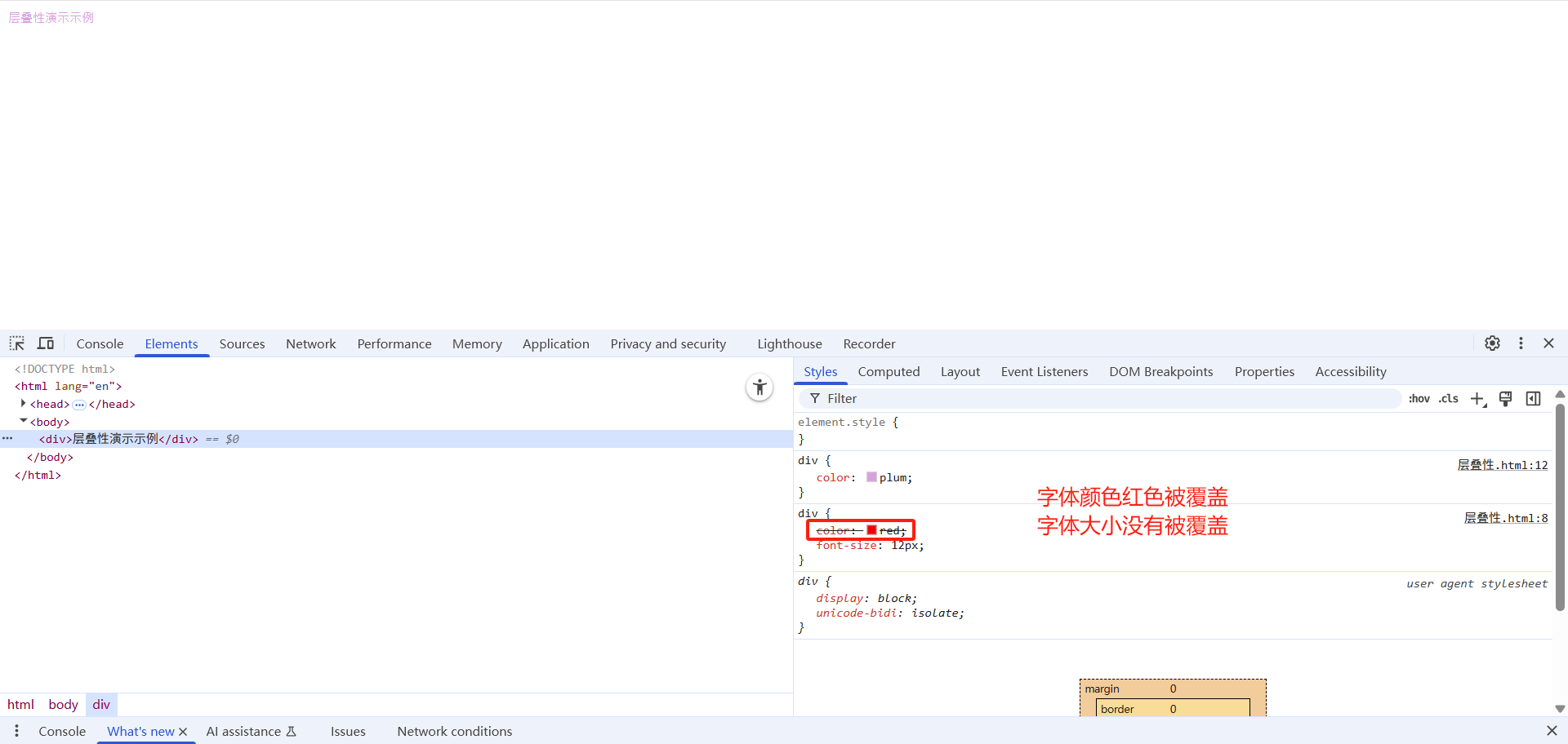
1.2 继承性
CSS中的继承: 子标签会继承父标签的某些样式,如文本颜色和字号。恰当地使用继承可以简化代码,降低 CSS 样式的复杂性。
子元素可以继承父元素的样式:(text-,font-,line-这些元素开头的可以继承,以及color属性)
<!DOCTYPE html>
<html lang="en">
<head>
    <meta charset="UTF-8">
    <meta name="viewport" content="width=device-width, initial-scale=1.0">
    <title>Document</title>
    <style>
        div {
            color: plum;
            font-size: 12px;
        }
    </style>
</head>
<body>
    <div>div中的文字
        <p>继承性案例演示</p>
    </div>
</body>
</html>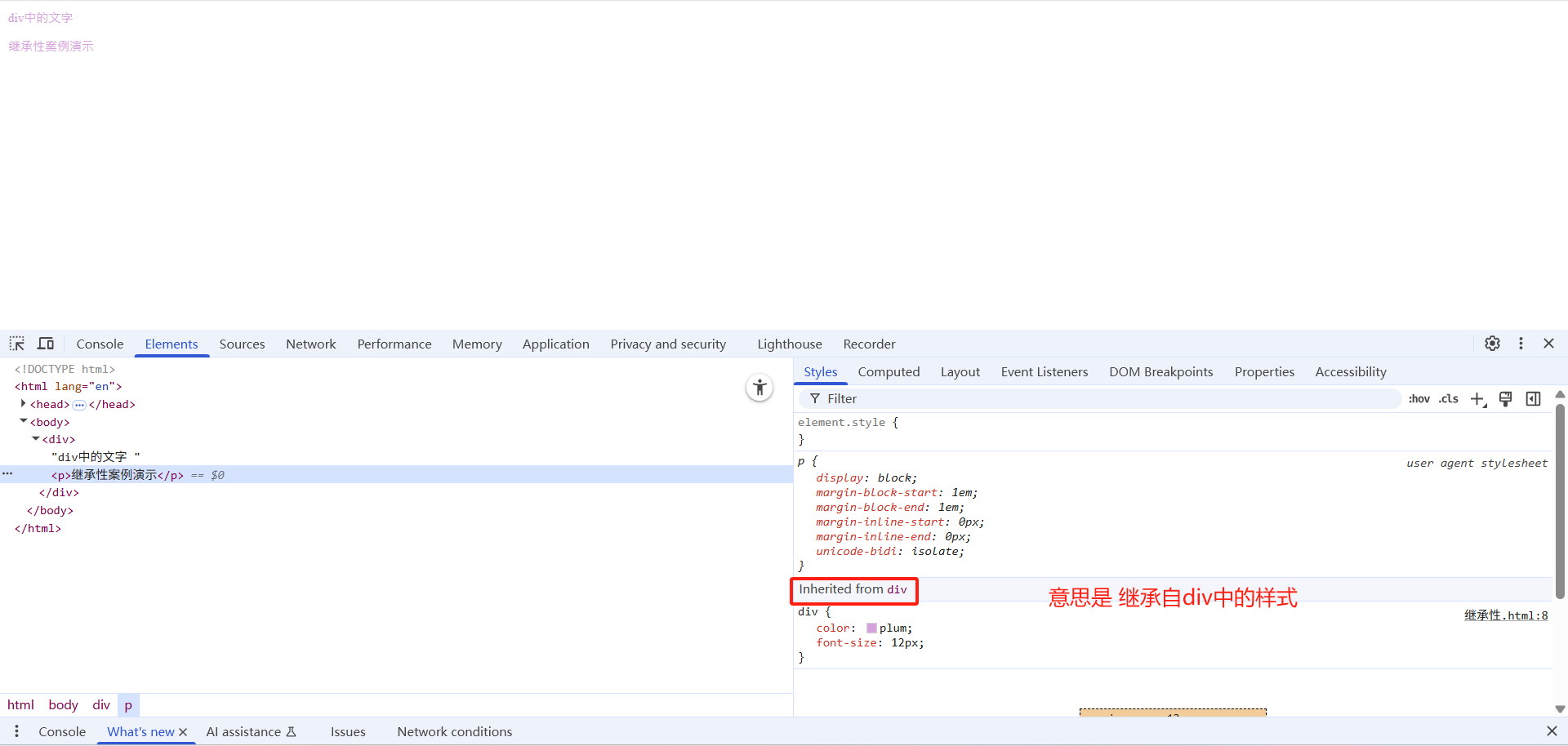
行高的继承性:
<!DOCTYPE html>
<html lang="en">
<head>
    <meta charset="UTF-8">
    <meta name="viewport" content="width=device-width, initial-scale=1.0">
    <title>Document</title>
    <style>
        body {
            font: 12px/1.5 Microsoft YaHei;
            color: plum;
        }
        div {
            font-size: 14px;
        }
        p {
            font-size: 16px;
        }
        li {
            font-size: 18px;
        }
    </style>
</head>
<body>
    <div>div中的文字</div>
    <p>p中的文字</p>
    <ul>
        <li>li中的文字</li>
    </ul>
</body>
</html>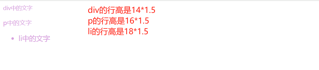
- 行高可以跟单位也可以不跟单位
- 如果子元素没有设置行高,则会继承父元素的行高为 1.5
- 此时子元素的行高是:当前子元素的文字大小 * 1.5
- body 行高 1.5 这样写法最大的优势就是里面子元素可以根据自己文字大小自动调整行高
1.3 优先级
当同一个元素指定多个选择器,就会有优先级的产生。
- 选择器相同,则执行层叠性
- 选择器不同,则根据选择器权重执行
选择器优先级计算表格:
| 选择器 | 权重值 |
|---|---|
| 继承 或 * | 0,0,0,0 |
| 元素选择器 | 0,0,0,1 |
| 类选择器/伪类选择器 | 0,0,1,0 |
| ID选择器 | 0,1,0,0 |
| 行内样式 style="" | 1,0,0,0 |
| !important | ∞ 无穷大 |
<!DOCTYPE html>
<html lang="en">
<head>
    <meta charset="UTF-8">
    <meta name="viewport" content="width=device-width, initial-scale=1.0">
    <title>Document</title>
    <style>
        body {
            color: red;
        }
        div {
            color: yellow
        }
        .div1 {
            color: blue!important;
        }
        #div1{
            color: green;
        }

    </style>
</head>
<body>
<div class="div1" id="div1" style="color: purple;">优先级文字示例</div>
</body>
</html>
优先级注意点:
- 权重是有4组数字组成,但是不会有进位。
- 可以理解为类选择器永远大于元素选择器, id选择器永远大于类选择器,以此类推。
- 等级判断从左向右,如果某一位数值相同,则判断下一位数值。
- 可以简单记忆法: 通配符和继承权重为0, 标签选择器为1,类(伪类)选择器为10, id选择器 100, 行内样式表为 1000, !important 无穷大。
- 继承的权重是0,如果该元素没有直接选中,不管父元素权重多高,子元素得到的权重都是0。
<!DOCTYPE html>
<html lang="en">
<head>
    <meta charset="UTF-8">
    <meta name="viewport" content="width=device-width, initial-scale=1.0">
    <title>Document</title>
    <style>
        body {
            color: red!important;
        }
        div {
            color: yellow
        }


    </style>
</head>
<body>
    <div>优先级文字示例</div>
</body>
</html>
权重叠加:如果是复合选择器,则会有权重叠加,需要计算权重。
计算示例:
| 选择器组合示例 | 权重计算 | 权重值 |
|---|---|---|
| div ul li | 0,0,0,1 + 0,0,0,1 + 0,0,0,1 | 0,0,0,3 |
| .nav ul li | 0,0,1,0 + 0,0,0,1 + 0,0,0,1 | 0,0,1,2 |
| .nav li | 0,0,1,0 + 0,0,0,1 | 0,0,1,1 |
| #nav li | 0,1,0,0 + 0,0,0,1 | 0,1,0,1 |
<!DOCTYPE html>
<html lang="en">
<head>
    <meta charset="UTF-8">
    <meta name="viewport" content="width=device-width, initial-scale=1.0">
    <title>Document</title>
    <style>
    /* div ul  li  ------>  0,0,0,3 */
  div ul li {
    color: red;
    list-style-type: none;
  }
  /* - .nav ul li   ------>      0,0,1,2 */
  .nav ul li {
    color: blue;
    list-style-type: none;
  }
  /* - .nav li ------>      0,0,1,1 */
  .nav li{
    color: plum;
    list-style-type: none;
  }
  /* - #nav ul   ------>      0,1,0,1 */
  #nav li{
    color: paleturquoise;
    list-style-type: none;
  }

</style>
</head>

<body>
    <div class="nav" id="nav">
        <ul>
            <li>li中的文字展示</li>
        </ul>
    </div>
</body>
</html>
2.盒子模型
2.1 网页布局的本质
网页布局的核心本质:就是利用 CSS 摆盒子。 
网页布局过程:
- 先准备好相关的网页元素,网页元素基本都是盒子Box。
- 利用 CSS 设置好盒子样式,然后摆放到相应位置。
- 往盒子里面装内容
2.2 盒子模型组成
盒子模型:把 HTML 页面中的布局元素看作是一个矩形的盒子,也就是一个盛装内容的容器。
CSS 盒子模型本质上是一个盒子,封装周围的 HTML 元素,它包括:边框、外边距、内边距、和 实际内容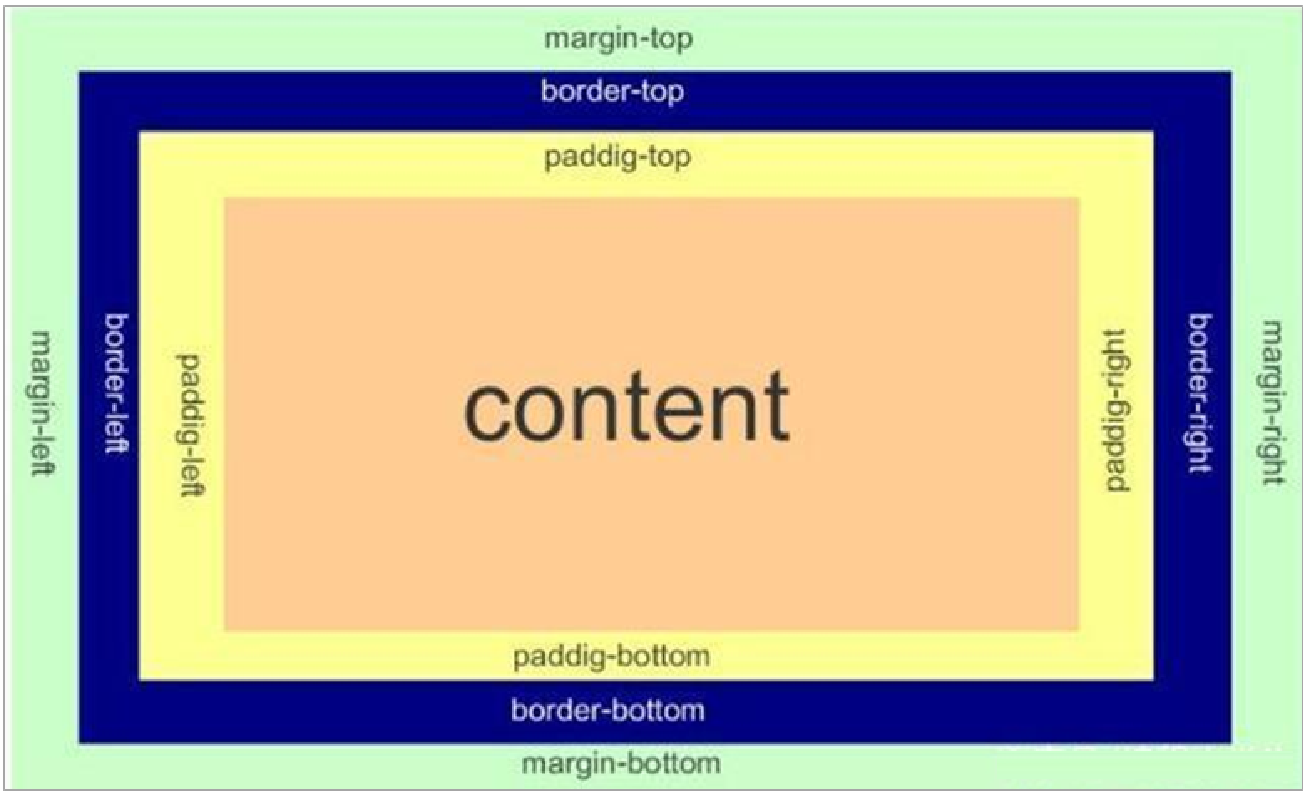
2.3 边框(border)
2.3.1 边框的使用
border可以设置元素的边框。边框有三部分组成:边框宽度(粗细) 边框样式 边框颜色;
| 属性 | 描述 | 示例值 |
|---|---|---|
| border-width | 设置边框宽度 | 5px, thin, medium, thick |
| border-style | 设置边框样式 | solid, dashed, dotted |
| border-color | 设置边框颜色 | red, #ff0000, rgb(255,0,0) |
| border | 简写属性 | 1px solid black |
| border-top | 上边框简写 | 2px dotted blue |
| border-bottom | 下边框简写 | 3px double green |
| border-left | 左边框简写 | 1px solid #ccc |
| border-right | 右边框简写 | 2px dashed purple |
<!DOCTYPE html>
<html lang="en">
<head>
    <meta charset="UTF-8">
    <meta name="viewport" content="width=device-width, initial-scale=1.0">
    <title>Document</title>
    <style>
        .div1 {
            width: 100px;
            height: 100px;
            border-width: 5px;
            border-style: none;
            border-color: plum;
        }
        .div2 {
            width: 100px;
            height: 100px;
            border-width: 5px;
            border-style: solid;
            border-color: blue;
        }
        .div3 {
            width: 100px;
            height: 100px;
            border-width: 5px;
            border-style: dashed;
            border-color: red;
        }
        .div4 {
            width: 100px;
            height: 100px;
            border-width: 5px;
            border-style: dotted;
            border-color: teal;
        }
    </style>
</head>
<body>
    <div class="div1"></div>
    <div class="div2"></div>
    <div class="div3"></div>
    <div class="div4"></div>
</body>
</html>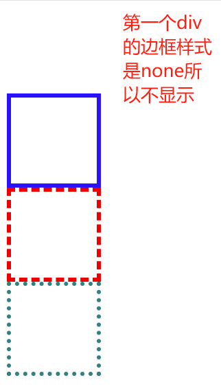
边框样式 border-style 可以设置如下值:
一般就只能用到前四个
| 边框样式值 | 描述 |
|---|---|
| none | 无边框 |
| solid | 实线边框 |
| dashed | 虚线边框 |
| dotted | 点线边框 |
| double | 双线边框 |
| groove | 3D凹槽边框 |
| ridge | 3D垄状边框 |
| inset | 3D内嵌边框 |
| outset | 3D外凸边框 |
边框简化和分开写法:
案例:
实现一个只有上边框是粉色 其余是蓝色的边框效果
<!DOCTYPE html>
<html lang="en">
<head>
    <meta charset="UTF-8">
    <meta name="viewport" content="width=device-width, initial-scale=1.0">
    <title>Document</title>
    <style>
        div {
            width: 100px;
            height: 100px;
            /* 边框简写写法 */
            border: 1px solid blue;
            /* 四条边框都可以分开设置三个属性 */
            border-top: 1px solid pink;
        }
    </style>
</head>
<body>
<div></div>
</body>
</html>
2.3.2 表格的细线边框
border-collapse 属性控制浏览器绘制表格边框的方式。它控制相邻单元格的边框。
构建一个表格,通过该属性控制表格的边框粗细
<!DOCTYPE html>
<html lang="en">
<head>
    <meta charset="UTF-8">
    <meta name="viewport" content="width=device-width, initial-scale=1.0">
    <title>Document</title>
    <style>
        table {
            height: 200px;
            width: 200px;

        }
        table ,tr ,th ,td {
            border: 1px solid plum;
            border-collapse: collapse;
            font-size: 14px;
            text-align: center;
        }
    </style>
</head>
<body>
    <table align="center" cellspacing="0">
        <tr>
            <th>姓名</th>
            <th>年龄</th>
            <th>性别</th>
        </tr>
        <tr>
            <td>张三</td>
            <td>18</td>
            <td>男</td>
        </tr>
        <tr>
            <td>李四</td>
            <td>20</td>
            <td>女</td>
        </tr>
        <tr>
            <td>王五</td>
            <td>55</td>
            <td>女</td>
        </tr>
    </table>
</body>
</html>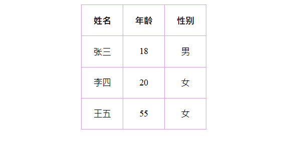
collapse 单词是合并的意思
border-collapse: collapse; 表示相邻边框合并在一起
2.3.3 边框对盒子大小的影响
边框会额外增加盒子的实际大小。因此我们有两种方案解决:
- 测量盒子大小的时候,不量边框。
- 如果测量的时候包含了边框,则需要 width/height 减去边框宽度
<!DOCTYPE html>
<html lang="en">
<head>
    <meta charset="UTF-8">
    <meta name="viewport" content="width=device-width, initial-scale=1.0">
    <title>Document</title>
    <style>
        #div1 {
            height: 100px;
            width: 100px;
            background-color: plum;
        }
        #div2 {
            height: 100px;
            width: 100px;
            background-color: plum;
            border: 10px solid red;
        }
    </style>
</head>
<body>
    <div id="div1"></div>
    <hr>
    <div id="div2"></div>
</body>
</html>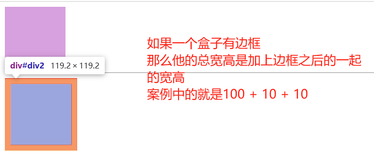
2.4 内边距(padding)
2.4.1 内边距的使用方式
padding 属性用于设置内边距,即边框与内容之间的距离。
合写属性
| 值的个数 | 含义描述 | 示例 |
|---|---|---|
| 1个值 | 四个方向都是10px内边距 | padding: 10px; |
| 2个值 | 上下10px,左右20px | padding: 10px 20px; |
| 3个值 | 上10px,左右20px,下15px | padding: 10px 20px 15px; |
| 4个值 | 上10px,右20px,下15px,左5px(顺时针方向) | padding: 10px 20px 15px 5px; |
<!DOCTYPE html>
<html lang="en">
<head>
    <meta charset="UTF-8">
    <meta name="viewport" content="width=device-width, initial-scale=1.0">
    <title>Document</title>
    <style>
        .div1 {
            width: 100px;
            height: 100px;
            background-color: plum;
            padding: 20px;
        }
        .div2 {
            width: 100px;
            height: 100px;
            background-color: plum;
            padding: 10px 20px;
        }
        .div3 {
            width: 100px;
            height: 100px;
            background-color: plum;
            padding: 10px 20px 15px;
        }
        .div4 {
            width: 100px;
            height: 100px;
            background-color: plum;
            padding: 10px 20px 15px 5px;
        }
    </style>
</head>
<body>
    <div class="div1">我是div中的内容 我来测试内边距</div>
    <hr>
    <div class="div2">我是div中的内容 我来测试内边距</div>
    <hr>
    <div class="div3">我是div中的内容 我来测试内边距</div>
    <hr>
    <div class="div4">我是div中的内容 我来测试内边距</div>
</body>
</html>
分写属性
| 属性 | 描述 | 示例值 |
|---|---|---|
| padding | 简写属性 | 10px 20px 15px 5px |
| padding-top | 上内边距 | 10px |
| padding-right | 右内边距 | 20px |
| padding-bottom | 下内边距 | 15px |
| padding-left | 左内边距 | 5px |
2.4.2 内边距会影响盒子实际大小
- 当我们给盒子指定 padding 值之后,发生了 2 件事情:
内容和边框有了距离,添加了内边距。
padding影响了盒子实际大小。 - 内边距对盒子大小的影响:
如果盒子已经有了宽度和高度,此时再指定内边框,会撑大盒子。
如何盒子本身没有指定width/height属性, 则此时padding不会撑开盒子大小。 - 解决方案:
如果保证盒子跟效果图大小保持一致,则让 width/height 减去多出来的内边距大小即可。
<!DOCTYPE html>
<html lang="en">
<head>
    <meta charset="UTF-8">
    <meta name="viewport" content="width=device-width, initial-scale=1.0">
    <title>Document</title>
    <style>
        .div1 {
            height: 100px;
            width: 100px;
            background-color: plum;

        }
        .div2 {
            height: 100px;
            width: 100px;
            background-color: plum;
            padding: 20px;
        }
    </style>
</head>
<body>
    <div class="div1">div中的文字</div>
    <hr>
    <div class="div2">div中的文字</div>
</body>
</html>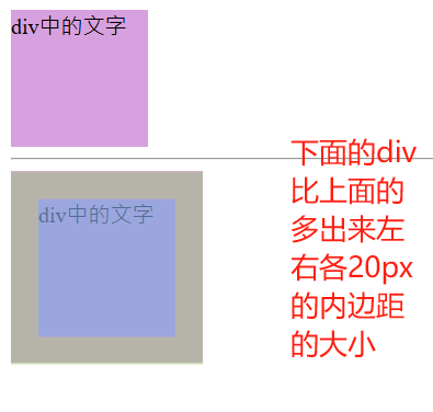
2.4.3 实战案例-新浪导航栏
元素像素和背景:
- 上边框为3像素,颜色为#ff8500
- 下边框为1像素,颜色为#edeef0
- 盒子高度为41像素,背景颜色为#fcfcfc
- 文字颜色为#4c4c4c
<!DOCTYPE html>
<html lang="en">
<head>
    <meta charset="UTF-8">
    <meta name="viewport" content="width=device-width, initial-scale=1.0">
    <title>Document</title>
    <style>
        .nav {
            height: 41px;
            background-color: #fcfcfc;
            border-top: 3px solid #ff8500;
            border-bottom: 1px solid #edeef0;
            line-height: 41px;
        }
        .nav a {
            display: inline-block;
            color: #4c4c4c;
            height: 41px;
            padding: 0 20px;
            font-size: 12px;
            text-decoration: none;
        }
        a:hover {
            background-color: #eee;
            color: #ff8500;
        }
    </style>
</head>
<body>
    <div class="nav">
        <a href="#">新浪导航</a>
        <a href="#">手机新浪网</a>
        <a href="#">移动客户端</a>
        <a href="#">微博</a>
        <a href="#">请登录</a>
    </div>
</body>
</html>
2.4.4 内边距不会影响盒子大小的情况
- 如果块级元素没有指定宽度则默认和浏览器宽度一样,这时候给指定内边距的时候不会撑开原本大小,除非指定宽度
- 当子元素没有指定宽度的时候添加内边距也不会撑开父元素的宽度,除非设置宽度
<!DOCTYPE html>
<html lang="en">
<head>
    <meta charset="UTF-8">
    <meta name="viewport" content="width=device-width, initial-scale=1.0">
    <title>Document</title>
    <style>
        h1 {
            height: 300px;
            background-color: pink;
            padding: 100px;
        }
        div {
            height: 100px;
            width: 300px;
            background-color: plum;
        }
        div p {
            width: 350px;
            padding: 30px;
            background-color: aqua;
        }
    </style>
</head>
<body>
    <h1></h1>
    <div>
        <p></p>
    </div>
</body>
</html>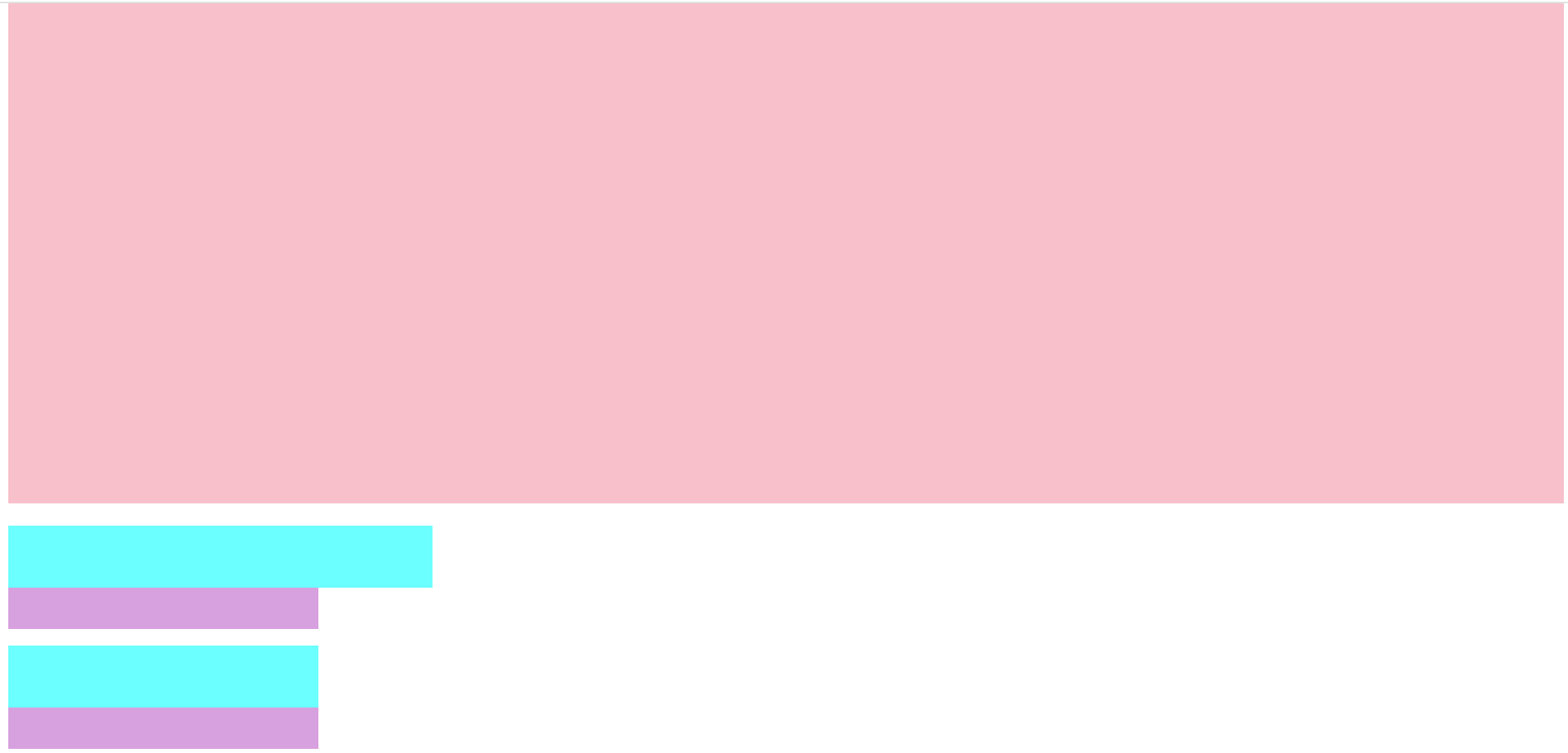
2.5 外边距(margin)
2.5.1 外边距的使用方式
margin 属性用于设置外边距,即控制盒子和盒子之间的距离。
| 属性 | 描述 | 示例值 |
|---|---|---|
| margin | 简写属性 | 10px 20px 15px 5px |
| margin-top | 上外边距 | 10px |
| margin-right | 右外边距 | 20px |
| margin-bottom | 下外边距 | 15px |
| margin-left | 左外边距 | 5px |
<!DOCTYPE html>
<html lang="en">
<head>
    <meta charset="UTF-8">
    <meta name="viewport" content="width=device-width, initial-scale=1.0">
    <title>Document</title>
    <style>
        .div1 {
            height: 100px;
            width: 100px;
            background-color: blue;
            margin-bottom: 10px;
        }
        .div2 {
            height: 100px;
            width: 100px;
            background-color: blue;
        }
    </style>
</head>
<body>
    <div class="div1">div1</div>
    <div class="div2">div2</div>
</body>
</html>
2.5.2 外边距典型应用-水平居中
外边距可以让块级盒子水平居中的两个条件:
- 盒子必须指定了宽度(width)。
- 盒子左右的外边距都设置为auto 。
常见的写法,以下三种都可以
1. margin-left: auto;   margin-right: auto;
2. margin: auto;
3. margin: 0 auto;<!DOCTYPE html>
<html lang="en">
<head>
<meta charset="UTF-8">
<meta name="viewport" content="width=device-width, initial-scale=1.0">
<title>Document</title>
<style>
div {
height: 300px;
width: 300px;
background-color: blueviolet;
margin: 0 auto;
}
</style>
</head>
<body>
<div></div>
</body>
</html>
注意:
以上方法是让块级元素水平居中,行内元素或者行内块元素水平居中给其父元素添加 text-align:center 即可。
<!DOCTYPE html>
<html lang="en">
<head>
    <meta charset="UTF-8">
    <meta name="viewport" content="width=device-width, initial-scale=1.0">
    <title>Document</title>
    <style>
        div {
            height: 300px;
            width: 300px;
            background-color: blueviolet;
            margin: 0 auto;
            text-align: center;
        }
    </style>
</head>
<body>
    <div>
        <span>div中span</span>
    </div>
</body>
</html>
2.5.3 外边距合并
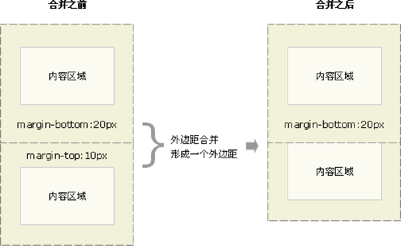
- 相邻块元素垂直外边距的合并 当上下相邻的两个块元素(兄弟关系)相遇时,如果上面的元素有下外边距 margin-bottom,下面的元素有上外边距 margin-top ,则他们之间的垂直间距不是 margin-bottom 与 margin-top 之和。取两个值中的较大者这种现象被称为相邻块元素垂直外边距的合并。
解决方案:
尽量只给一个盒子添加 margin 值。
<!DOCTYPE html>
<html lang="en">
<head>
    <meta charset="UTF-8">
    <meta name="viewport" content="width=device-width, initial-scale=1.0">
    <title>Document</title>
    <style>
        .div1 {
            height: 100px;
            width: 100px;
            background-color: pink;
            margin-bottom: 20px;
        }
        .div2 {
            height: 100px;
            width: 100px;
            background-color: pink;
            margin-top: 10px;
            margin-bottom: 30px;
        }
        .div3 {
            height: 100px;
            width: 100px;
            background-color: pink;

        }
    </style>
</head>
<body>
    <div class="div1">div1元素内容</div>
    <div class="div2">div2元素内容</div>
    <div class="div3">div3元素内容</div>
</body>
</html>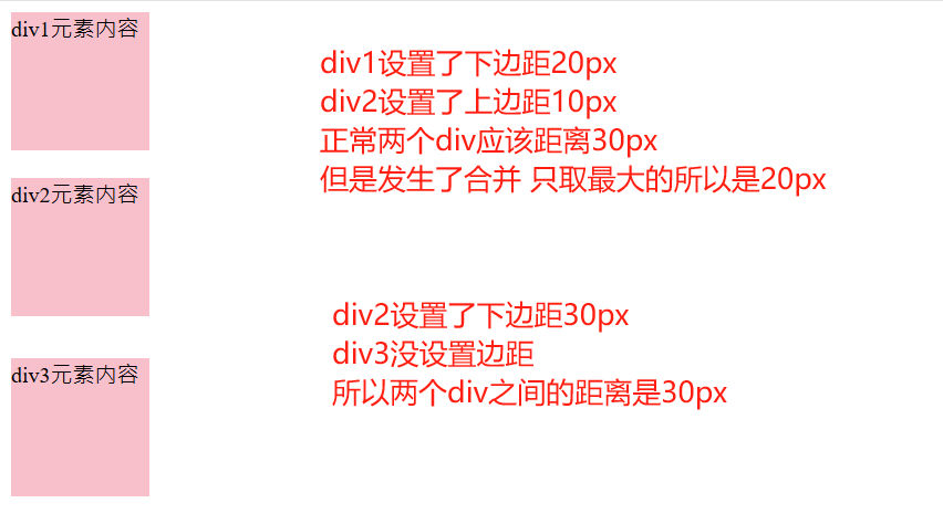
- 嵌套块元素垂直外边距的塌陷 对于两个嵌套关系(父子关系)的块元素,父元素有上外边距同时子元素也有上外边距,此时父元素会塌陷较大的外边距值。
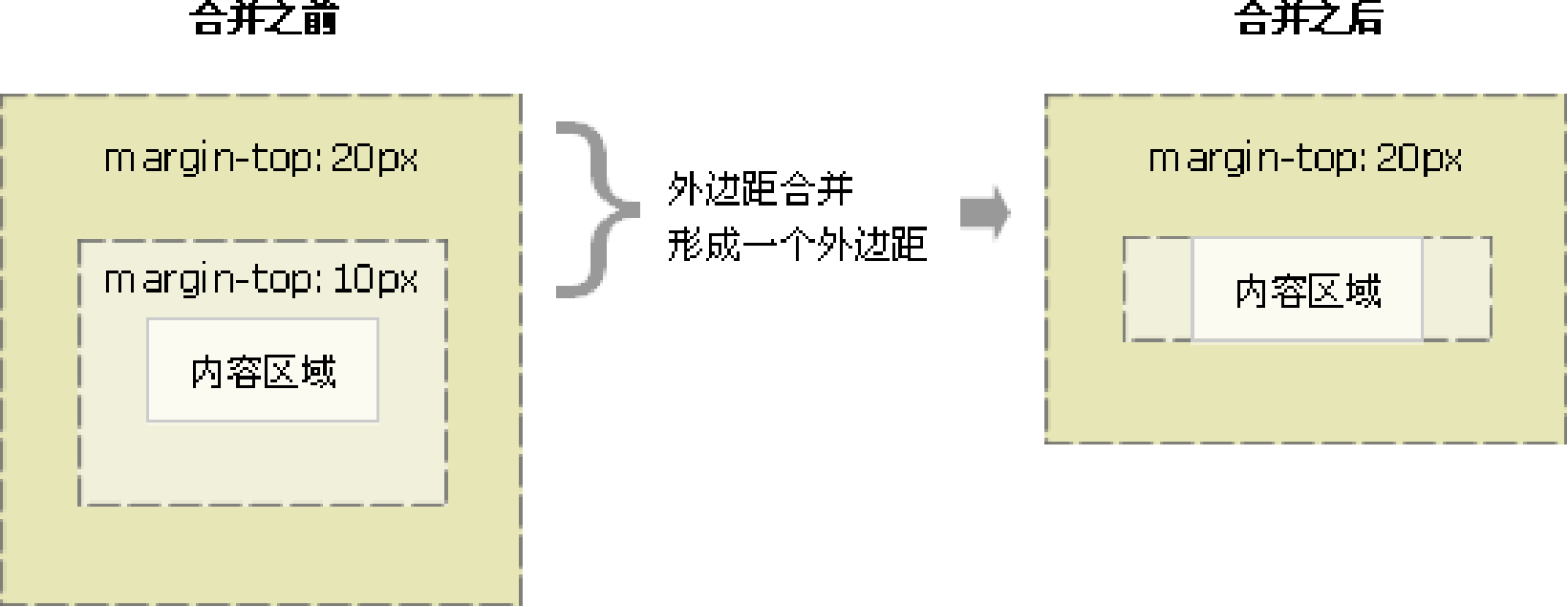
解决方案:
- 可以为父元素定义上边框。
border: 1px solid transparent; - 可以为父元素定义上内边距。
padding: 1px; - 可以为父元素添加 overflow:hidden。
overflow: hidden;
<!DOCTYPE html>
<html lang="en">
<head>
    <meta charset="UTF-8">
    <meta name="viewport" content="width=device-width, initial-scale=1.0">
    <title>Document</title>
    <style>
        .div1 {
            height: 100px;
            width: 100px;
            background-color: blueviolet;
            margin-top: 50px;
        }
        .div2 {
            height: 200px;
            width: 200px;
            background-color: blue;
            /* border: 1px solid transparent; */
            /* padding: 1px; */
            overflow: hidden;
        }
    </style>
</head>
<body>
    <div class="div2">
        <div class="div1"></div>
    </div>
</body>
</html>
2.5.4 清除内外边距
网页元素很多都带有默认的内外边距,而且不同浏览器默认的也不一致。因此我们在布局前,首先要清除下网页元素的内外边距。 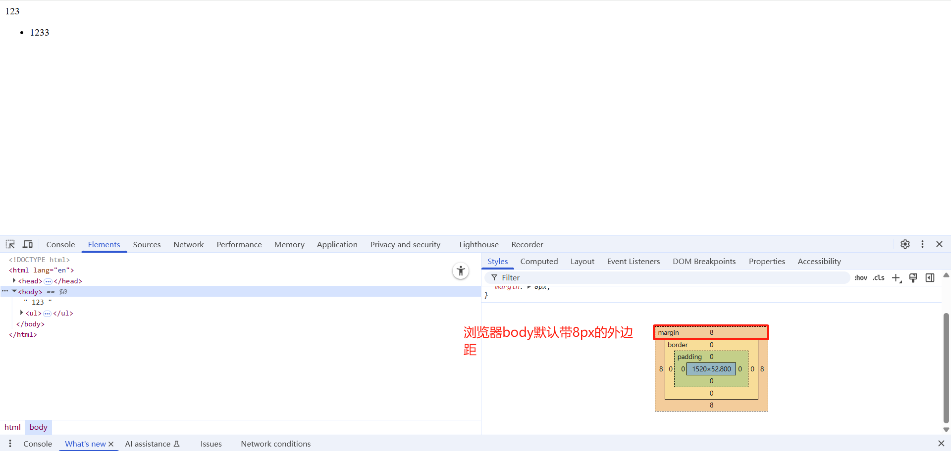
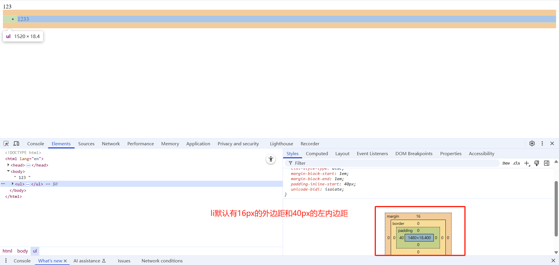
解决方式:
直接将所有元素都清楚内边距和外边距
<!DOCTYPE html>
<html lang="en">
<head>
    <meta charset="UTF-8">
    <meta name="viewport" content="width=device-width, initial-scale=1.0">
    <title>Document</title>
    <style>
         * {
    padding:0;   /* 清除内边距 */
    margin:0;    /* 清除外边距 */
  }
    </style>
</head>
<body>
    123
    <ul>
        <li>1233</li>
    </ul>
</body>
</html>
3.案例演示
用所学知识实现一个产品模块的展示效果
<!DOCTYPE html>
<html lang="en">
<head>
    <meta charset="UTF-8">
    <meta name="viewport" content="width=device-width, initial-scale=1.0">
    <meta http-equiv="X-UA-Compatible" content="ie=edge">
    <title>综合案例-产品模块</title>
    <style>
      * {
          margin: 0;
          padding: 0;
      }
      body {
          background-color: #f5f5f5;
      }
      a {
          color: #333;
          text-decoration: none;
      }
      .box {
          width: 298px;
          height: 415px;
          background-color:#fff;
          /* 让块级的盒子水平居中对齐 */
          margin: 100px auto;
      }
      .box img {
          /* 图片的宽度和父亲一样宽 */
          width: 100%;
      }
      .review {
          height: 70px;
          font-size: 14px;
          /* 因为这个段落没有 width属性 所有 padding不会撑开盒子的宽度 */
          padding: 0 28px;
          margin-top: 30px;
      }
      .appraise {
          font-size: 12px;
          color: #b0b0b0;
          margin-top: 20px;
          padding: 0 28px;
      }
      .info {
          font-size: 14px;
          margin-top: 15px;
          padding: 0 28px;
      }
      .info h4 {
          display: inline-block;
          font-weight: 400;

      }
      .info span {
          color: #ff6700;
      }
      .info em {
          font-style: normal;
          color: #ebe4e0;
          margin: 0 6px 0 15px;
      }
    </style>
</head>
<body>
    <div class="box">
        <img src="images/img.jpg" alt="">
        <p class="review">快递牛,整体不错蓝牙可以说秒连。红米给力</p>
        <div class="appraise">来自于 117384232 的评价</div>
        <div class="info">
               <h4> <a href="#">Redmi AirDots真无线蓝...</a></h4>
               <em>|</em>
               <span> 99.9元</span>
        </div>
    </div>
</body>
</html>